A silly typeface
When we allow ourselves to be silly, we break free from the constraints of logic and rules. Imagination knows no bounds when we dare to be silly. It paves the way for new ideas to flourish, unconventional approaches to problem-solving, and innovative designs. Silly antics spark the creative fire within us, enabling us to push boundaries and question the status quo.
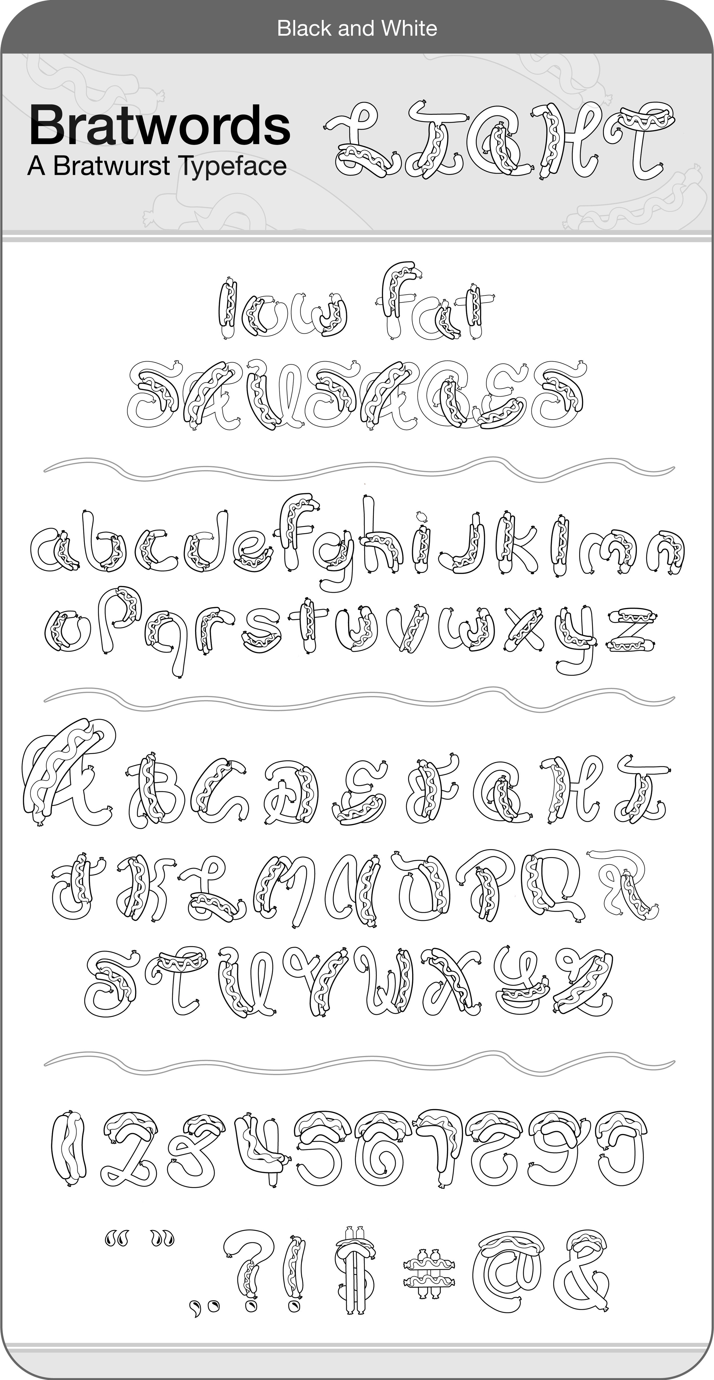
Understanding typographic anatomy is essential for anyone working with type. Mastery of these minute details allows designers to select and pair typefaces effectively, achieving the intended mood and message. The Bratwords typeface is splendidly silly, and it’s up to you to craft the message!
Typography is not just about choosing fonts and arranging letters on a page; it is an art form that involves understanding the intricate details of each letterform. Like the human body, each letter possesses its own anatomy, with distinct features and structures that give it character and style.
Four varieties to choose from
-
When it comes to typography, designers have a plethora of styles to choose from. One option that has gained significant popularity in recent years is light, high-contrast typography. This unique style offers various benefits that can enhance a design's overall visual impact and readability. Using a light-coloured font against a dark background, the contrast between the two enhances legibility, making the text easier to read. By employing this Bratwords Light style, designers can ensure that their designs are inclusive and accessible to a broader audience, enhancing the overall user experience.
-
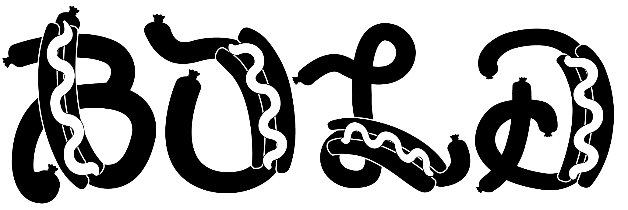
Dark typography is a powerful design element that undoubtedly commands attention. Its ability to make a statement and evoke a strong emotional response makes it a versatile tool for many purposes. When combined with ample white space, it creates a visually engaging and easy-to-read experience. Bold, dark typography uses are diverse and versatile. Its commanding presence can enhance various design projects. Whether for print or digital media, Bratwords Bold has your back (or buns?)!experience.
-
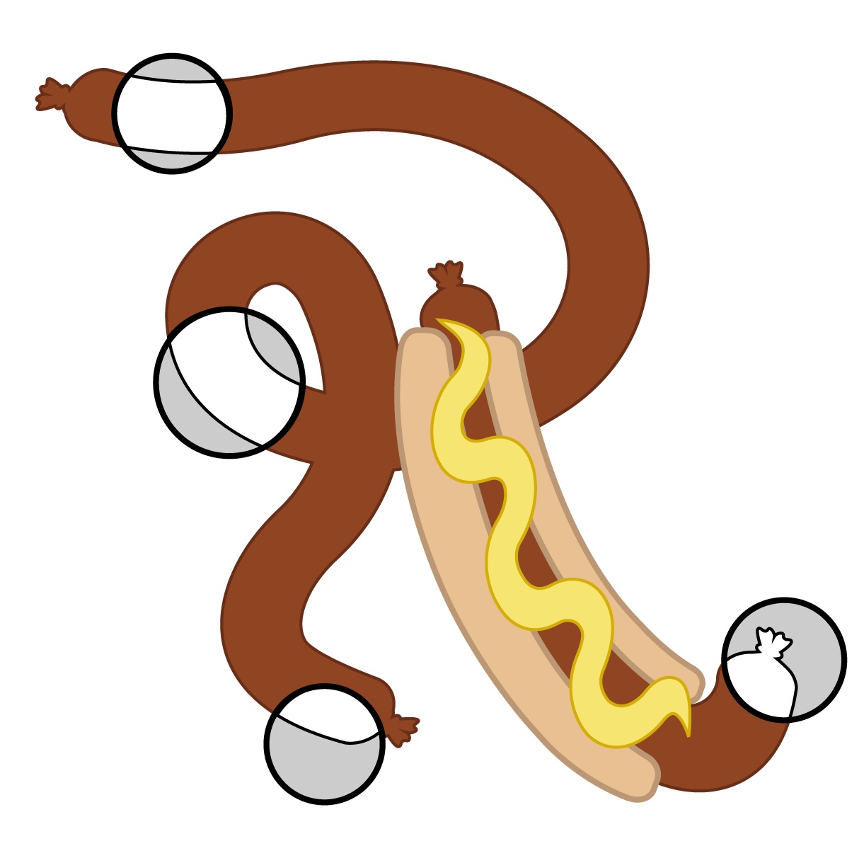
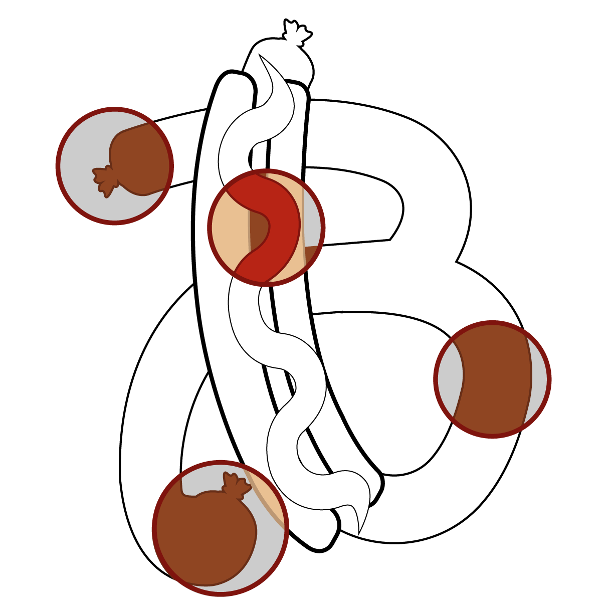
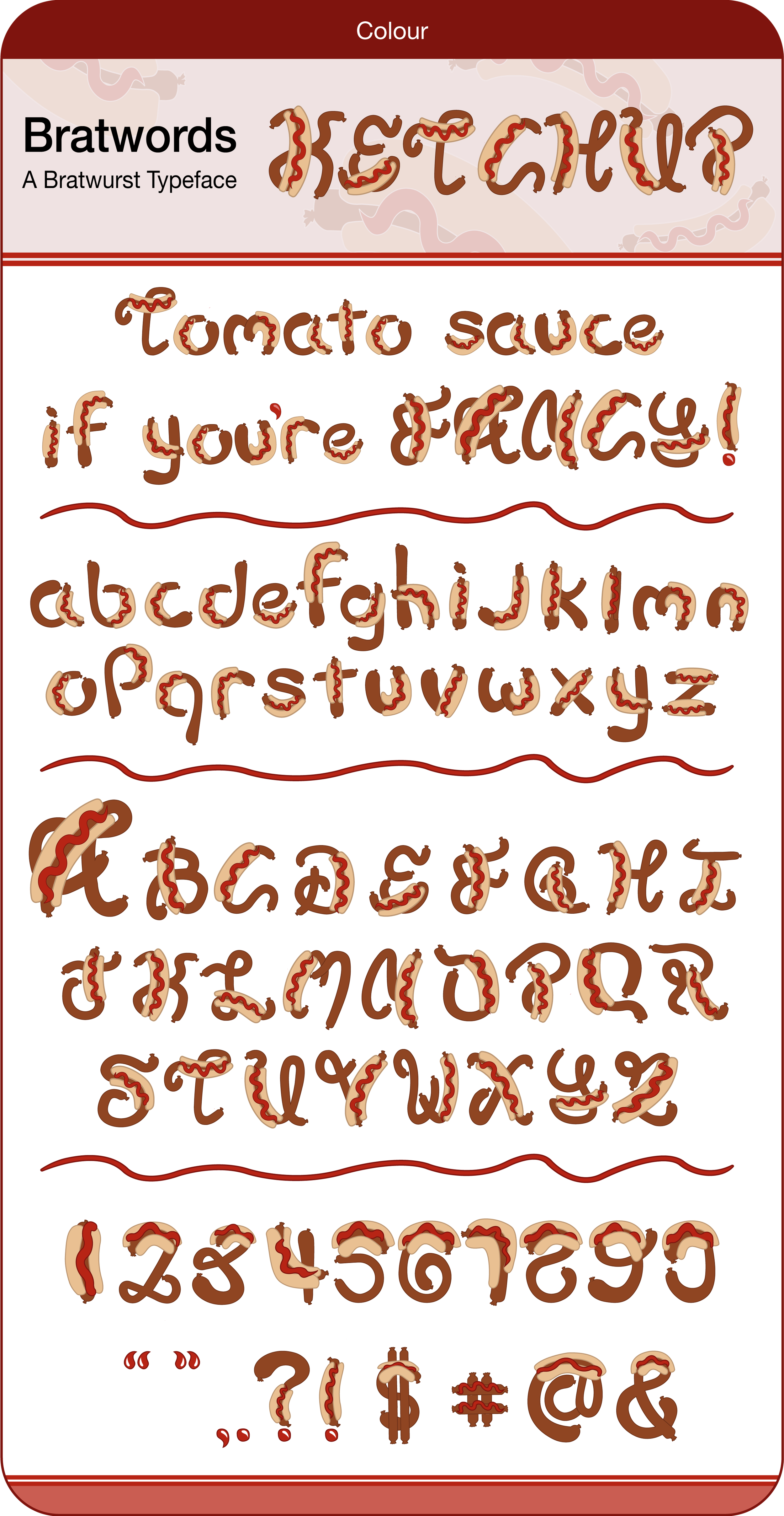
Ketchup's tangy and slightly sweet flavour profile has made it a classic staple in households globally. Its tomato base provides a delightful combination of acidity and subtle umami, making it a perfect complement to burgers, hot dogs, and french fries.
Red typography is bold, energetic, captivating and represents a sense of power and excitement. Its vibrant hue radiates a zest for life and creates a sense of urgency and importance. Whether used in a headline or as part of a design element, red typography demands to be seen and heard. And so does Bratwords Ketchup!
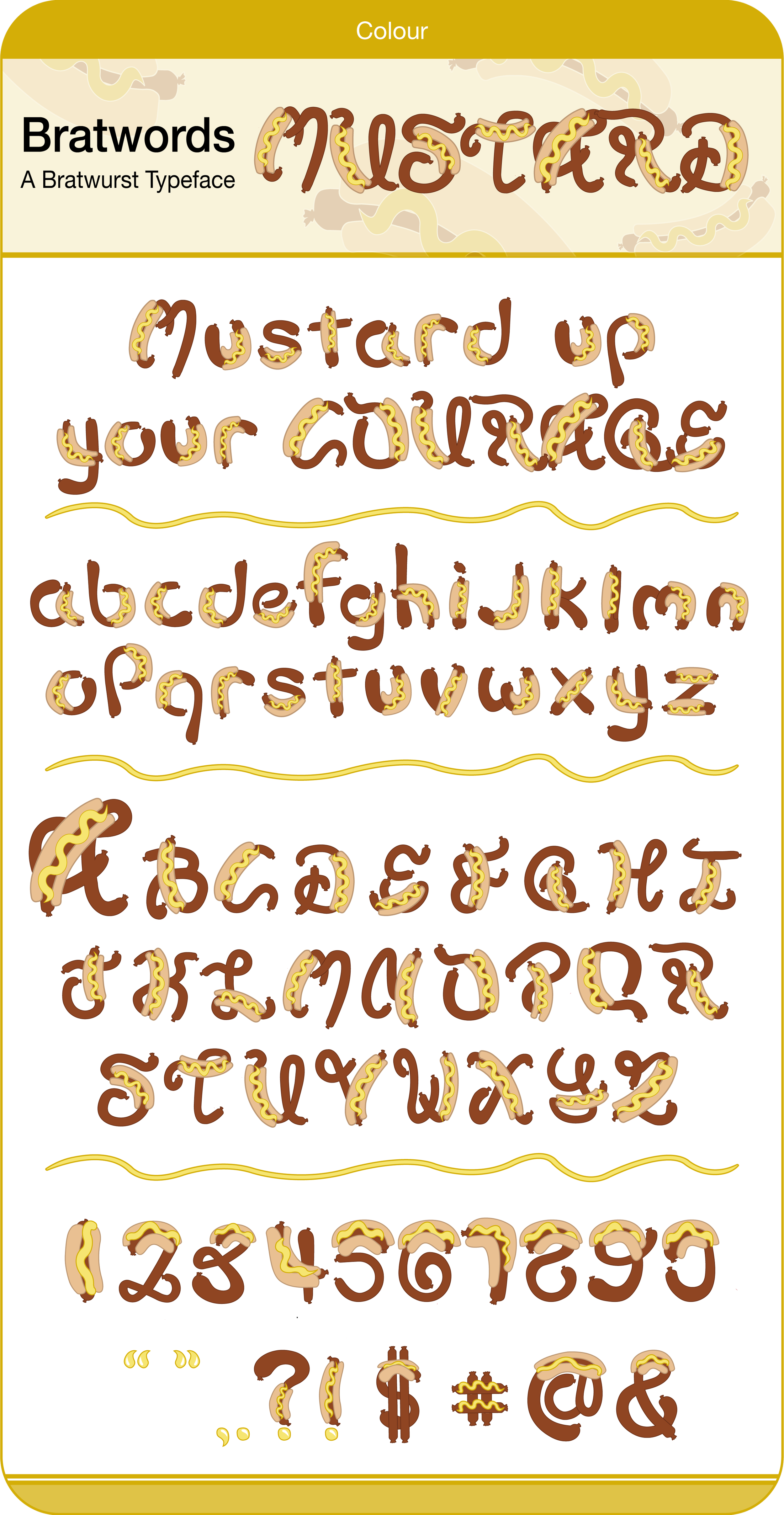
Artists have long recognised the power of yellow to convey a sense of optimism and hope. Van Gogh's famous sunflowers project a sense of pure joy, radiating life and energy onto his canvas. Yellow tones in paintings can transform ordinary scenes into extraordinary experiences, adding an element of excitement and enthusiasm.
Yellow is also a vivid symbol of friendship and connection. The gift of yellow roses signifies appreciation and happiness in relationships, expressing gratitude and bringing people closer together. That being said, I hope you enjoy this gift of yellow mustard Bratwords!
Hot and ready, just for you.


